Credit Card Rewards Web App.
A platform with enhanced rewards redeeming experience, strengthening customer loyalty, driving business growth for card issuers, and partnering merchants.
Role
Solo Product Designer
UX Researcher
Contribution
UX/ UI Design
User research
User Flows
Prototyping
Usability Testing
Year
July- September 2022

Overview
Retailer offers through credit card rewards program help cardholders save money, while drive more spending from cardholders, thus create more revenue for both card issuer and merchants.
Problems
01/
02/
Users drop off easily during the process of redeeming retailer offers because it often takes them too much time and efforts to find and get their favorable offers.
Point Summary Analysis and Earning rates visualization on most credit card rewards platforms are confusing. Visual clutters and overloaded information on screens give them headache making them impatient with the search of rewards.
How might we make Point Summary Analysis more digestible and facilitate the process of searching / redeeming users' favorable retailer offers?
Goals
-
Increase the conversion rate of retailer offers.
-
Improve the user engagement rate and retention rate.
-
Make a financial related platform feel less bland and more edgy.
Design Solutions
01/
Leverage multiple touch points to increase users’ awareness of retailer offers from their favored brands and initiate a simple process to redeem the offers.

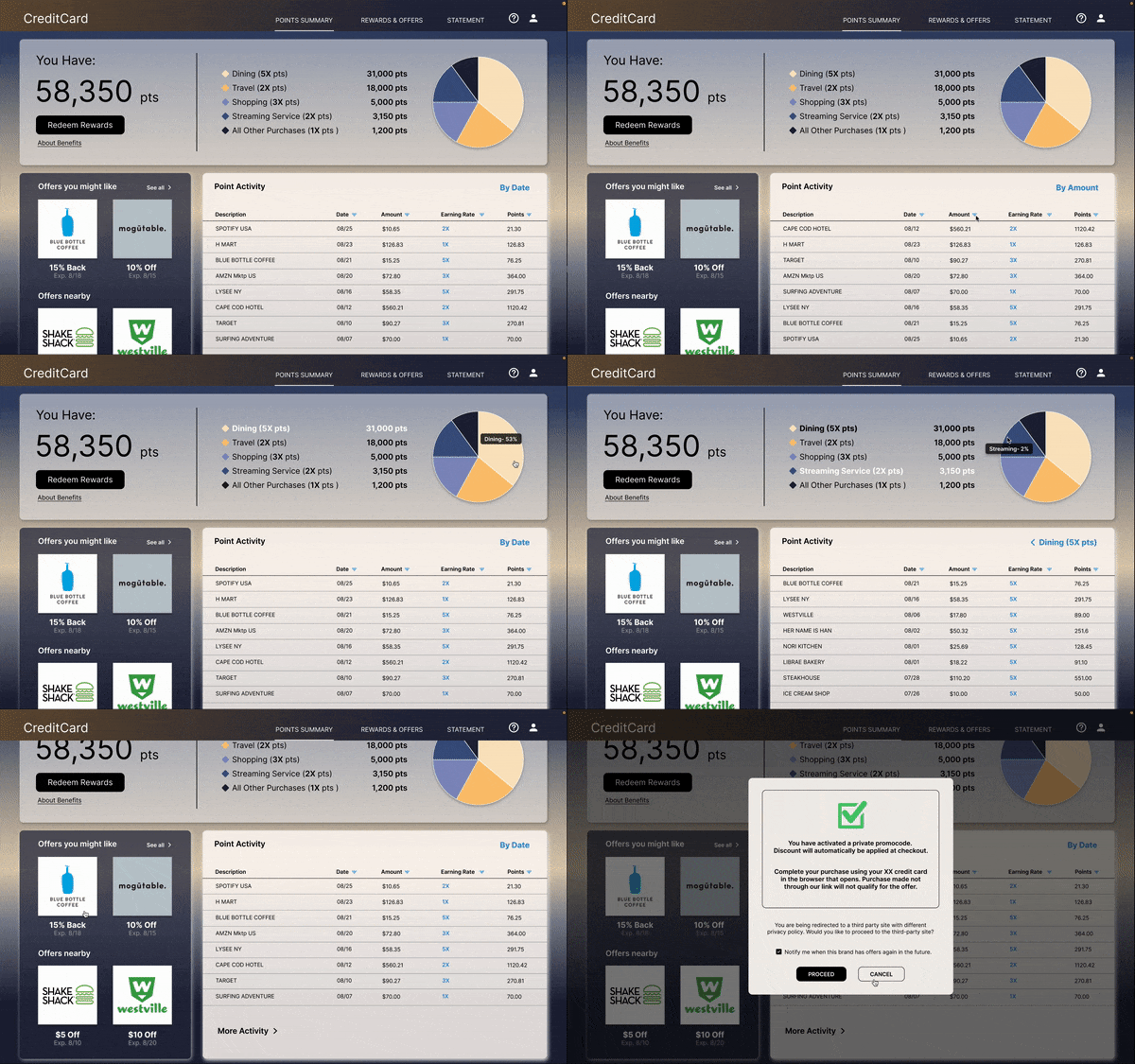
Smart Recommendations widget on the Point Summary screen promotes retailer offers based on user’s shopping history and current location.

User can get retailer offers right from the Point Summary screen, without even browsing the rewards page.
02/
Optimize search and navigation tools to help users save time on offer hunting.
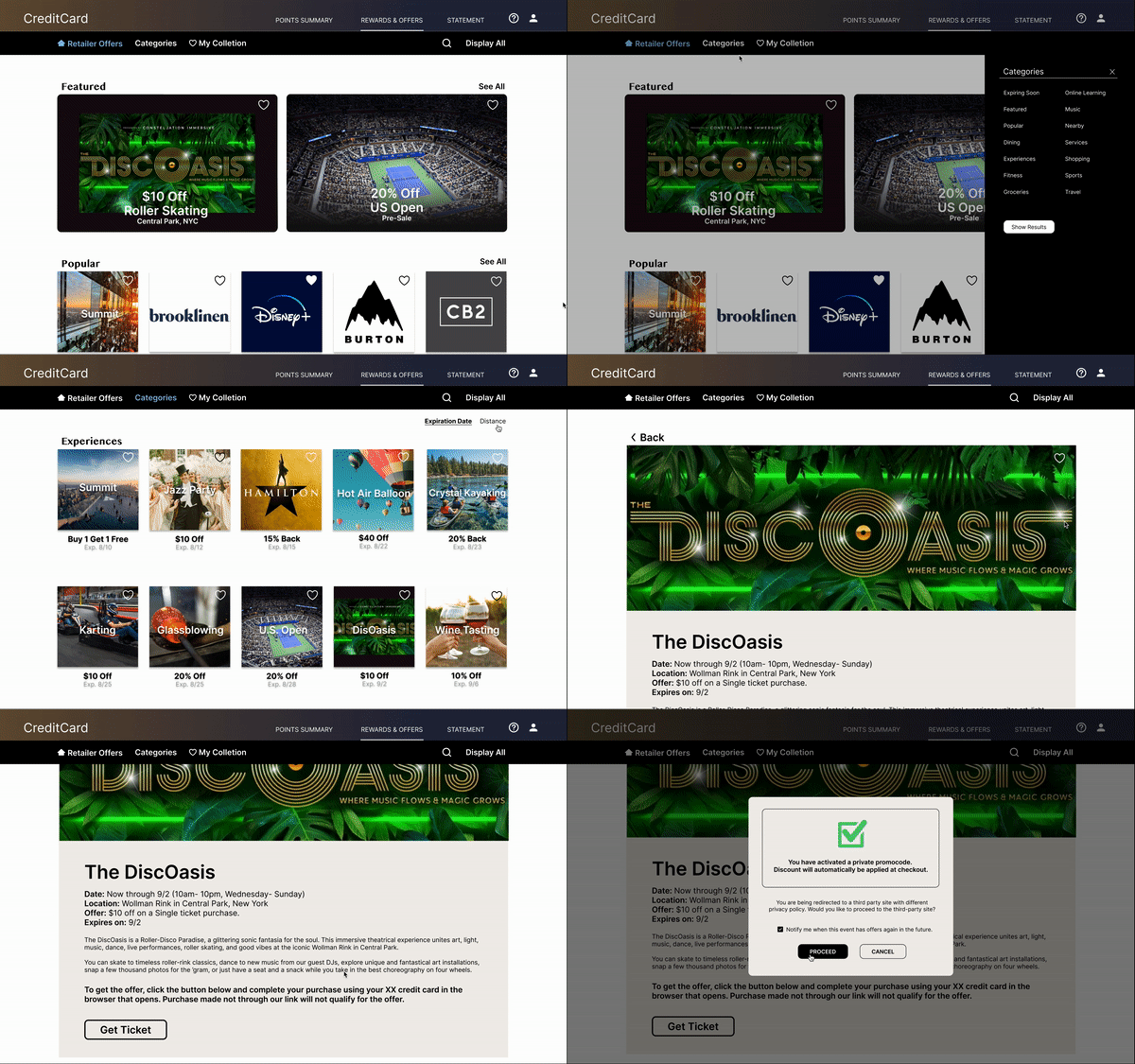
Users can curate and access their personal collection of brands to see if there are any current offers.


03/
Streamlined UI and interaction design considering visual hierarchy, brand identity, and accessibility, to create delightful user experience.


-
Interactive Pie Chart with color blind-accessible palette and labels to help differentiate each section.
-
The landing dashboard gives users a concise overview of the total points, earning rates by categories and recent point activity, the key information demanded by users.
Using landmarks to help users navigate the site, including users who rely on assistive technologies
Impact
90%
SATISFACTION RATE
Tested on 6 participants
ENGAGEMENT RATE & CONVERSION RATE
Users appreciate the smart recommendations of offers that raise their interest of redeeming rewards. The interactive elements, clear navigation and search, plus the simple offers redemption flow all help convert.
RETENTION RATE
Users enjoy the overall visual and interactive design of the platform. They feel excited and relaxed while using the app, and wish to continue the engagement.
USABILITY
Users especially love the efficient search tool and being able to create their personal collection of brands for quick browsing. They also find the proposed Point Summary analysis ery clear and digestible.
Full Story
Concept Research
I conducted survey (quantitative research) with 28 users and open-ended interview (qualitative research) with 5 users, which I then turned into empathy maps to better understand people’s current experience with the redemption flow of credit card rewards and offers online, and find out what aspects of the existing credit card platforms and redemption flows they find most challenging.
Key
Pain Points
01/
Dull and inconvenient Experience
Navigation & Search
-
Endless scrolling just to find a favorable brand/ offer, or none at all.
-
Redemption flow is too complicated, takes too many steps.
-
Call to Action is not clear.
Unaware of Offers
-
Not knowing when their favorable brands/ things are having offers decreases the chance of users even checking retailer offers page.
Unappealing UI
-
Site design is very monotonous and boring.
02/
Information Overload
Credit card rewards websites often display too much information on a single page. Some companies combine regular bank statement with point-earning analysis together, making users feel overwhelmed and confused.
Competitive Analysis
I also looked at several credit card rewards sites to get a feel of users current experience, how competitors are handling point earning report and rewards redemption flow. I wanted to find out what's been done, what's causing friction in user's journey, and what good ideas there are to learn from.
The main features affecting user experience of point summary and redeeming retailer offers were:
-
Rewards breakdown in chart form v.s. point activity table only.
-
Earning rates shown v.s. hidden.
-
No categories for search v.s. search by categories. No sort v.s. has sort.
-
Merchant offers( shopping goods/ services) and entertainment offers (experiences and events) on different sites with different designs.
-
Buy with passcode v.s. buy through link v.s. save to card for future purchase.
-
Institutional UI design v.s. sleek and modern UI design
Design Process
Journey Map
After researching on users and competitors, I then mapped out target users' journey of checking Point Summary dashboard and rewards redemption flow to uncover opportunities where I can solve users’ pain points and make the offers redemption process more usable and engaging.

Information Architecture
Sorting out the sitemap of the website help organize site structure and define main navigation hierarchy.

Design Opportunity
-
Boost Users’ awareness of retailer offers off the rewards page to increase opportunities to convert.

-
Personalize search tools and content feed to speed up the search process.
Define
Problems
01/
02/
Users are unaware of retailer offers as a rewards option. Cash back or air milage are usually their top rewards options.
Users don't want to spend too much time on searching for retailer offers because getting offers is like getting "a cherry on top of the cake", nice but not necessary.
Updating
User Flow
By incorporating Offers Recommendation Widget on the Point Summary Screen and reducing redemption steps, the updated flow boosts offers visibility, and enable users to redeem favorable retailer offers quickly, without even visiting the retailer offers landing page. Optimizing search and filter tools also prevents users from dropping off quickly.
Existing User Journey

Proposed User Journey
Users might just come to the page to see their point earning and activities, but will likely notice retailer offers from their favored brands showing on the side panel and redeem the offer right on the spot.

Design
& Refine
Point Summary Dashboard
After several rounds of ideation and prototyping, I came up with a solution by creating:
-
A concise Point Summary dashboard with an Interactive Pie chart and point activity table to display recent activity.
-
A Smart Offers Recommendation widget that is eye-catching but does not outshine the main point summary dashboard.
-
A redemption process where users need to use a promo code at the 3rd party checkout page to seal the deal.

Retailer Offer Navigation Bar
The navigation bar went through many iterations to finally arrive at a clean design with filter-functioned tabs situated to the left side while general search on the right.
Clicking on the search icon will release the search bar.
Clicking on the categories tab will release the filter panel.


Usability Testing
I conducted 5 remotely moderated usability testings with 6 participants throughout design iterations from low-fidelity prototype to hi-fidelity prototype. I developed insights from test findings to drive design forward and kept improving details.
Key Findings
01/
Pie Chart
02/
Sort and Filter
03/
Offer Redemption
Pie chart seems detached from the legend, since it doesn’t have any labels. Having each pie change colors at hover state would complete hide the original color and leave users wondering which category they are looking at.
Some users didn’t get that category filters were combined with sort under ‘Sort’ tab. They wanted category filters to be more visible and accessible.
Users were confused about whether they need to manually copy/paste passcode at checkout to get the offer or if the code would be applied automatically at checkout.
“I like using My Collection to personalize what brands and offers I actually want to see. This saves me a lot of time in searching and browsing."
“The offers panel on the side of Point Summary definitely caught my attention, especially when a brand I like popping up.”
Final Solutions
Point Summary Dashboard

-
The panels displaying Point Summery and Point Activity are completely interactive with each other. Click on a color on the pie chart to display recent point activity of the selected category in the table below.
-
Appealing UI and Color blind-accessible palette to help differentiate each section.

To simplify offer redemption mechanism, a private promocode is generated when users clicks on Redeem Button. The code will automatically be applied at checkout when user’s credit card is used. No more Copy/ Paste.
Search, Filter and Redeem Offers

Clicking on 'categories' tab and search icon to release hidden category filter and search bar when needed. 'Sort by' options locate at the top right corner of the screen. This prevents visual clutter and gives a clean look of the page.

By 'hearting' any brands and experiences offers, those items are saved in My Collection. Next time, users can navigate straight to the collection and check out if their favored things are having special offers now.
Rewards and Offers landing page features image carousel promoting special offers as a landmark/ focal point.
