Credit Card Rewards Web App.
A credit card reward Web App with concise point summary and enhanced redemption experience for retailer offers.
Scope
Concept Research
Problem framing
Design development
Wireframe & prototype
User testing
Contribution
UX/ UI Design
User research
Design strategy
Branding
Year
2022

Context
This project aims to help people find and redeem their favorable retailer offers efficiently on a credit card rewards web app.
Rewards and offers are one of the main benefits that attract people getting a credit card. However, the truth is people do not remember all the earning rates by categories to make the most point accumulation, some don’t even know that there are retailer offers available to them.
Besides redeeming for cash and airline milage, people are interested in getting more retailer offers, but most of the current credit card rewards web apps are too complicated and often consists of multiple different sites. Most people do not spend too much time on ‘shopping’ for bonus offers and want to be able to find their favorable offers faster.
Challenge
01/
Streamline credit card point earning summary for users to easily understand points breakdown and check point activity.
02/
Create an enjoyable and efficient searching and redeeming experience of retailer offers for users.
Goal
-
Increase the conversion rate of retailer offers.
-
Improve the user engagement rate and retention rate.
-
Make a financial related platform feel less bland and more edgy.
Impact
90% Users found the design increased their awareness of the retailer offers, and saved them time to find their favorable offers.
Conducted usability test with hi-fidelity prototype with 6 participants. All of them appreciated the smart recommendations of offers, clear navigation and search, as well as the straightforward redemption flow.
UI design was very appealing and delightful to users that they would want to continue to be on the platform.
Users loved overall visual design of the web app, they felt excited and fascinated when they were on this credit card rewards site as if they were on travel / leisure sites.
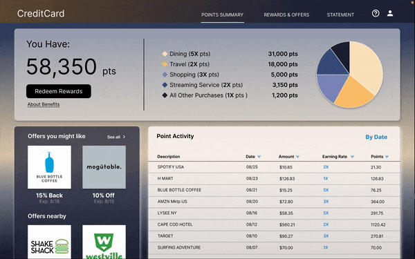
User felt the Point Summary very digestible and engaging.
Users appreciated the delightful interaction of the point summary and activity chart, which contained just enough information they need for day to day quick checking. They liked the option to check more activity and benefits when they need.
Design Solutions
Increased users' awareness of retailer offers
-
Leveraging data from users' spending history and location to recommend offers on the side panel on Point Summary dashboard.
-
Option to turn on notification email when a favored brand has offer.
Optimized Search and Navigation
-
Boost offer visibility by visual hierarchy, data algorithm, user's spending history and preference.
-
My Collection allows users to curate their personal feeds and save time on searching.Users can navigate to 'My Collection' to see if brands they have favorited are having promotions.
-
Retailer Offers page is optimized for quick search though top search bar, and a hidden filter panel under categories tab.
Simplified redemption flow
-
Synchronize all merchant offers and entertainment offers as retailer offers on one platform.
-
User can redeem offers directly from the offer side panel on Point Summary Dashboard.
-
One Click to get offer: Private code activated automatically and applied at checkout directly.
Concise Point Summary
-
Create a Point Summary page with concise analysis, just enough information for users to see their earning rates and recent earning activity.
-
Interactive Pie chart and point activity table to display recent activity.


-
Interactive Rewards breakdown pie chart. Click on a category to display recent point activity of the selected category in the table below.
-
Side panel with smart recommendations of retailers offers users might like based on users' shopping history and bookmarked brands. Also showing offers nearby users' current location.
-
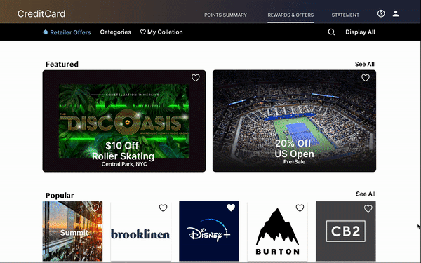
Rewards and Offers landing page features image carousel promoting special offers as a landmark/ focal point.

-
Retailer Offers homepage showcases featured offers, popular offers and nearby offers in the first half of the page, followed by smart recommendations of a few categorized offers for users based on their spending history.
-
Optimized for quick search though top search bar, and a hidden filter panel under categories tab.


-
By 'hearting' any brands and experiences offers, those items are saved in My Collection. Next time, users can navigate straight to the collection and check out if their favored things are having special offers now.
Full Story
Concept Research
I conducted survey (quantitative research) with 28 users and open-ended interview (qualitative research) with 5 users, which I then turned into empathy maps to better understand people’s current experience with the redemption flow of credit card rewards and offers online, and find out what aspects of the existing credit card platforms and redemption flows they find most challenging.
Key Findings
01/
02/
03/
Top 3 favored rewards:
Cash back (86%), airline milage (68%), retailer offers (25%).
Users would like to redeem more retailer offers but often drop off easily because it takes them too much time and efforts to find an offer they like.
Many users find point earning report is confusing. 70% of users want to see the earning rate by category in the analysis.
04/
54% of users redeem rewards on desktop website.
05/
Too many different websites for different retailer offers for a (bank's) credit card (shopping, entertainment, sports all on separate sites) making the browsing and redeeming experience very inconsistent and confusing.
Opportunities
I decided to focus my design on solving 2 problems
01/
Making point summary easy to read.
02/
Help users find retailer offers they like by improving the search tool, boosting offers visibility and eventual redemption.
Competitive Analysis
I also looked at several credit card rewards sites to get a feel of users current experience, how competitors are handling point earning report and rewards redemption flow. I wanted to find out what's been done, what's causing friction in user's journey, and what good ideas there are to learn from.
The main features affecting user experience of point summary and redeeming retailer offers were:
-
Rewards breakdown in chart form v.s. point activity table only.
-
Earning rates shown v.s. hidden.
-
No categories for search v.s. search by categories. No sort v.s. has sort.
-
Merchant offers( shopping goods/ services) and entertainment offers (experiences and events) on different sites with different designs.
-
Buy with passcode v.s. buy through link v.s. save to card for future purchase.
-
Institutional UI design v.s. sleek and modern UI design
Personas
Based on research findings, I created personas reflecting target users' traits and needs.


Journey Map
Mapping target users' journey from checking reward point summary on account dashboard to selecting a reward offer reveals opportunities to make redemption process more usable and engaging.

Framing
Pain Points
01/
Dull and inconvenient Experience
Navigation & Search
-
Endless scrolling just to find a favorable brand/ offer, or none at all.
-
Redemption flow is too complicated, takes too many steps.
-
Call to Action is not clear.
Unaware of Offers
-
Not knowing when their favorable brands/ things are having offers decreases the chance of users even checking retailer offers page.
Unappealing UI
-
Site design is very monotonous and boring.
02/
Information Overload
Credit card rewards websites often display too much information on a single page. Some companies combine regular bank statement with point-earning analysis together, making users feel overwhelmed and confused.
Problem Statement
How might we turn credit card rewards redeeming experience from an afterthought task into an uplifting, stress-free exploration for a wanted prize?
Design
Sitemap
Difficulty with website navigation was a primary pain point for users, so I used that knowledge to create a sitemap. My goal here was to make strategic information architecture decisions that would improve overall website navigation. The structure I chose was designed to make things simple and easy.

Wireframing
I studied various layouts and navigation flow on paper wireframes before making decision on the features and layout that would best enhance user experience and solve user paint points before moving on to digital wireframes


Prototyping & Usability Testing
I conducted 5 remotely moderated usability testings with 6 participants throughout my 5 design iterations from low-fidelity prototype to hi-fidelity prototype. I developed insights from test findings to drive design forward and kept improving details.
Key Findings
01/
Pie Chart
02/
Sort and Filter
03/
Offer Redemption
User found Pie chart a bit plain and hard to read since it doesn’t have any labels on chart and color tone for each section seems too much alike to be easily differentiated.
Some users didn’t get that category filters were combined with sort under ‘Sort’ tab. They wanted category filters to be more visible and accessible.
Users were confused about whether they need to manually copy/paste passcode at checkout to get the offer or if the code would be applied automatically at checkout.
“I like using My Collection to personalize what brands and offers I actually want to see. This saves me a lot of time in searching and browsing."
“The offers panel on the side of Point Summary definitely caught my attention, especially when a brand I like popping up.”
Design Iterations


Pie Chart
To make the pie chart more interactive and visually accessible, I played with different tones/ hues/ saturation/ contrast to land a final design that also aligns with overall UI color scheme.
I also tried various hover effects to create the final label style that is easy to read, visually coherent and doesn't block the pie chart color.


Retailer Offer Navigation Bar
The navigation bar went through many iterations to finally arrive at a clean design with filter-functioned tabs situated to the left side while general search on the right.
Clicking on the search icon will release the search bar.
Clicking on the categories tab will release the filter panel.


Categories Filter
To make reward category filters more visible and usable for users. I separated it out from ‘Sort’ in earlier iteration, then added a categories tab in the navigation bar with options on slide panel, while keeping ‘sort’ options directly on the top right corner above offer lists.
I also simplified the UI of the panel for a cleaner look.


Offer Redemption Message Window
To simplify offer redemption mechanism, I made the promocode private instead of public. Users no long needs to deal with promocode manually, instead, they can get the offer simply by clicking the offer link to generate a private code which will automatically be applied at checkout when user’s credit card is used.
Hi- Fidelity Prototype